
Burndown Chart & Burnup Chart
Original
-
 Renee Fey
 -
 2020-09-10 16:02:00
 -
 9127
9127
Burndown Chart & Burnup Chart
Visual presentation of data is a great way to display the progress of a project. Burndown chart and burnup chart are the two often applied tools in product development to check the progress. The two both have x-axis and y-axis to indicate the work and the time, and two lines, one is the ideal and the other is the actual, to compare with each other and show the differences. What are they not in common?
A burndown and a burnup chart of a porject. According to the burndown chart, the team did not do anything in the middle of the project but heroically completed everything at the end. The burnup chart depicts the whole picture: the scope was expanded at the start of the project, and some scope was omitted to complete the project by the deadline, while the team made steady progress.
Burndown Chart


Image From Wikipedia
A burndown chart is often used in Scrum to overview the task left to do versus time and to foresee when the work will be done. The vertical axis usually represents the backlog, either in hours or story points, and the horizontal axis indicates time. An ideal burndown chart is the actual tasks remaining line meets the horizontal axis, which means the work planned in this iteration is done within the timeframe.
Looking at the burndown chart above,
- For the first five days, the actual remaining work line is above the ideal remaining work line. It means there is more work left than the original predicted and the project is behind schedule.
- From Day 6 till Day 14, the actual remaining work line is far below the ideal one. It means there is less work left than planned and the project is ahead of schedule.
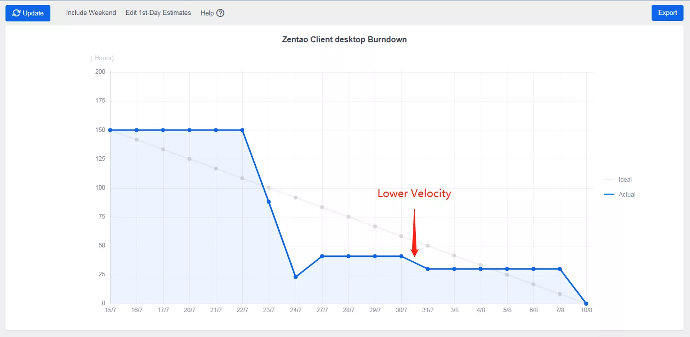
The line in the burndown chart can tell you when the team velocity is lower, so it is also the time that the Scrum Master needs to step in and see what holds back the team. A burndown chart can tell more than that. Read Burndown charts and the stories it can tell for how the team is doing in a project
Burnup Chart
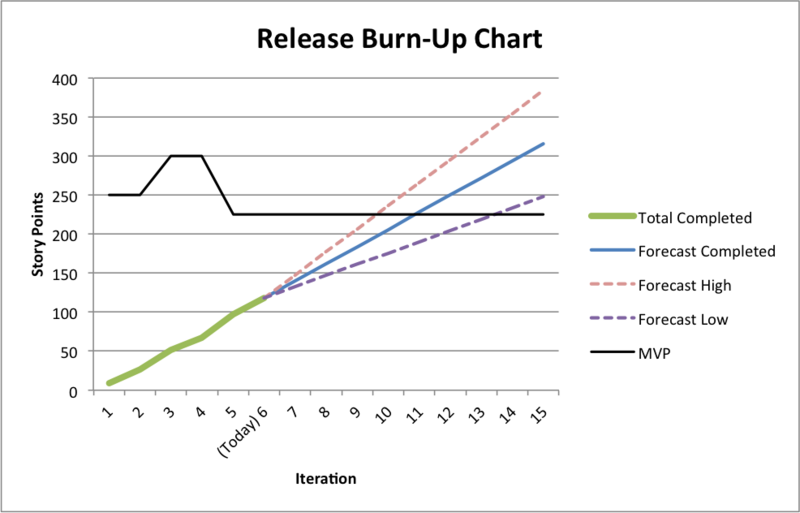
Image From Wikipedia
A burnup chart shows the amount of work completed over time. It is often related to a release, so it is also called a release burnup chart. The vertical axis represents the amount of work and can be measured in different ways such as story points, issue count, or estimates. The horizontal axis represents time in days. The distance between the lines on the chart is the amount of work remaining. When the project has been completed, the lines will meet.
A burnup chart can reveal the deviation from the planned project path. In the burnup chart above,
- MVP is the Minimum Viable Product, which is the scope that each sprint is supposed to complete.
- The green line is the total story points completed as of today.
- The blue line is the work predicted completion line, which means the work should be done on Day 11.
- The pink dotted line is Forecast High, which means the team can finish the work earlier than expected if they have a higher velocity.
- The purple dotted line is Forcast Low, which means there will be a delay and the team experiencing a lower velocity.
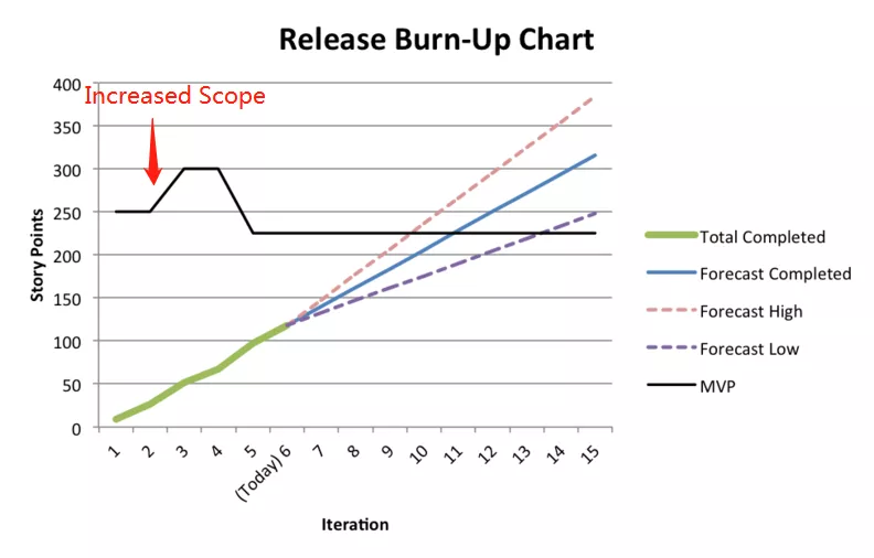
Like a burndown chart, the project and the team health can be read from a burnup chart. The increased scope in Day 2 means more stories are added to this iteration, but the scope is decreased on Day 4. This could be that the Scrum Master should confirm with the Product Owner about the changed scope of user stories and to see why it is changed and whether it is changed randomly without noticing the product owner and such.
Burndown Chart vs. Burnup Chart
Both burndown and burnup have pros and cons. When you choose a chart to present the progress of your projects, always think about your goal. What information do you want your audience to see? What point are you trying to make? Are you presenting it to your clients or just to your team? Bear these questions in your mind and refer to the comparisons below.
- Simplicity: A burndown is simple with just one line presenting the work done, while a burnup has the scope line as an extra line to refer to
- Information: A burnup with more than two lines can provide more information, especially the scope change.
- Presented to the customer:
- For fixed-scope projects: A burndown is preferable if you are doing a fixed-scope project, as the change of scope will not be demonstrated in it.
It is all about your goal, so choose it wisely.
The primary determinant of whether to use a burn up or burn down chart is the task at hand, or the target. Are you presenting to customers to ensure the project's survival? Are you attempting to energize the project team? Are you merely attempting to broaden your experience and comprehension of what is going on in the project? The answers to these questions will decide which chart will be used.
Fixed scope projects
A project can have a well-defined restricted scope under limited circumstances. If a project is guaranteed to have a set scope, a burnup chart shares no more detail than a burndown chart, so the burndown chart, which is simper, is preferred.
See also
Reference
1. https://en.wikipedia.org/wiki/Burn_down_chart
2. https://en.wikipedia.org/wiki/Scrum_(software_development)#Release_burn-up_chart

Support
- Book a Demo
- Tech Forum
- GitHub
- SourceForge
About Us
- Company
- Privacy Policy
- Term of Use
- Blogs
- Partners
Contact Us
- Leave a Message
- Email Us: [email protected]


