
| Taotao |
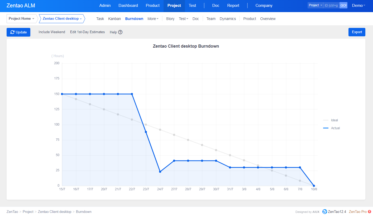
ScenarioSprint: Jan 25, 2021- Jan 29, 2021.Tasks: 5, each 7 hours. So with one assigned user, this means for a 5 day sprint, the overview tab shows exactly 35 hours total workload and 35 hours of available man power. As a man works 7 hours per day, it in ideal world the man works 7 hours per day. Now, in the picture below you see the white ideal line. The green line shows how the actual work would look. If a worker finishes exactly one 7 hour task per day, and updates the task every evening (move it to done). As we can tell, the actual line is always at the end of day below the ideal line.
The red line represents how the actual time would move each day, e.g. on Jan 25, we finish one task (7h) so at the end of the day it is at 28 hours. Then in the morning on Jan 26, no task done yet, we start with an actual of 28 hours, then in the evening of 26. after the second task finished (7 hours), we end at 21 hours. What to visualize in the BurndownThe actual line is NEVER on the ideal line (except in the morning of 25. and the evening of 29.). If we just look at the red line, so basically to see how the actual looks each morning and evening, then again, the actual time is never on the ideal time. In other words, comparing the actual line to the ideal line at any point in time, does NOT tell whether we are ahead or behind the schedule. If we finish 7 hours workload per day, then the workload is distributed ideal with respect to scrum. However, this will not be reflected in the burndown chart. Why the burndown lines are like thisThe Burndown in ZenTao start with complete workload that has to be done (35 h) and ends with desired workload to be finished (0 h). However, it actually should show how much work should be left at the end of the day. That is, on Jan 25 it should show 28 hours.( 35 hours complete workload, 5 days, makes 35/5 = 7 hours per day, and 35 -7 = 28 hours). And on Jan 26 then 28-7=21h , on Jan 27 then 14hours, on Jan 28 it should be 7 hours and then finally on Jan 29 the final 0 hours. If you want to always show at the beginning of the day the leftover workload, then it should start with 35 hours, and end with 7 hours on Jan 29. This would correspond to the yellow line. So if one wants to consider the ideal workload left at the end of each day, then the ideal line should look like the green line. If one wants to consider the ideal workload at the beginning of each day, then the ideal line should be the yellow line. And finally, if you look at the numbers next to the white line (these are the values of the white line dots for each day). Here the difference between two days is always about 8.7 hours, which does not fit the the actual ideal 7 hours difference per day. SolutionThe fix for this is also very easy, move the start of the white line down by "total workload"/"number of days", or move the end of the white line up by "total workload"/"number of days". If you want to read more about the Burndown, check the articles below. |
fantasy
|
 |
Products
- ZDOO
- ZDOO Cloud
Support
- Book a Demo
- Tech Forum
- GitHub
- SourceForge
About Us
- Company
- Privacy Policy
- Term of Use
- Blogs
- Partners
Contact Us
- Leave a Message
- Email Us: support@zentaoalm.com


