
Burndown charts and the stories it can tell
- 2017-10-26 16:27:00
- Michi Mirai
- Original 12451
A burn down chart is a graphical representation of work left to do versus time. The outstanding work (or backlog) is often on the vertical axis, with time along the horizontal. That is, it is a run chart of outstanding work. It is used to predict when all of the work will be completed.
 It is often used in agile software development methodologies such as Scrum. However, burn down charts can be applied to any project containing measurable progress over time. Outstanding work can be represented in terms of either time or story points. [From Wikipedia, the free encyclopedia]
With burndown chart tools, managers and team members can:
- Schedule automatic chart creation (reviewing charts daily is recommended).
- Visualize quickly progress and performance.
- Use search function to recall previous data when planning future sprints
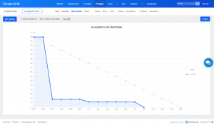
What a burndown chart can tell
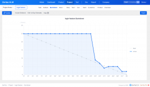
An ideal burndown would be like the one shown above. Tasks are done gradually as time goes by. The two lines, the blue ideal reference line and the red actual line, are met at the end of the project, which means what has to be done is done. The project goal is done. Look at the lines below and see what story a burndown chart can tell.
- A good team burndown
This burndown is a demonstration of work done by an experienced team. The team can complete tasks on time and reach the sprint goal. What is more, it can adapt to the backlog.
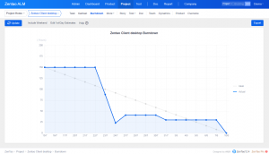
- A "too-late" team burndown
This burndown chart says that your team did not finish the task. During the entire sprint, the team was late and failed to adjust their work. It is obvious that user stories waiting to be finished, and they should be futher split and moved to the next sprint.
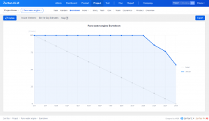
- A "too-early" team burndown
This burndown shows that the team finishes the project faster than expected. Although the team might be able to do more user stories, they tend to not to do so. User stories were overestimated, so the team was capable to finish all stories earlier than expected. This reveals that the team velocity was not estimated reasonably.
- A "go-up-to-sky" team burndown
The first sprint done by a team usually looks like this one. Besides tasks waiting to be finished, tasks are added to the sprint. Or tasks are re-estimated and thus changed.
Benefits of Burndown Charts
To some extend, burndown charts can make teams constantly reevaluate their performance daily and prioritize work as necessary, which helps maintain the accuracy of sprint and project backlogs as well as the Scrum board. Besides, project managers save time by using software to automatically run charts, rather than creating them manually.What's more, team members also save time by tracking progress visually, instead of sorting through email, tasks and documents for status updates and project managers can plan more effectively, especially when teams have to add or drop members, by consulting chart data from previous sprints. You can get good experience in project management software with a Burndown chart.
Burndown chart is a must-have feature in a project management tool for project managers to track the progress of a project. It is flexible to choose either hours or story points as the measurement of work in ZenTao.
More readings on burndown charts
Products
- ZDOO
- ZDOO Cloud
Support
- Book a Demo
- Tech Forum
- GitHub
- SourceForge
About Us
- Company
- Privacy Policy
- Term of Use
- Blogs
- Partners
Contact Us
- Leave a Message
- Email Us: support@zentaoalm.com


